Hi, I'm Vero! (۶•̀ᴗ•́)۶✧
Visual Designer and Illustrator
~ Turning insights into impactful designs ~

Marketing

Social Media
Brand Identity - Advertising
UX/UI
UX/UI

UX/UI - Landing Pages
Product Photography

Editorial Design + Illustration

Brand Storytelling
Branding - UX/UI
Textile Illustration

Picture Book Illustration + Editorial Design
Product Design + Illustration
Custom Portraits Illustration

Typography + Merch Design

I’m a creative and collaborative design professional with 9 years of experience in Design and Illustration. Fluent in English and Spanish, and proficient in Figma, Adobe CC, and Procreate, I bring a blend of creativity, technical proficiency, and user-centered problem-solving 💻I specialize in creating user-friendly digital experiences and visually compelling content that aligns with brand goals. Passionate about starting new projects and learning from others, I thrive in environments where I can combine creativity and functionality to drive meaningful results ✨Willing to relocate to pursue new professional opportunities 🚀Here you can see an interactive version of some of the projects in this portfolio!Let's work together! (o˘◡˘o)
Let's work together! (o˘◡˘o)
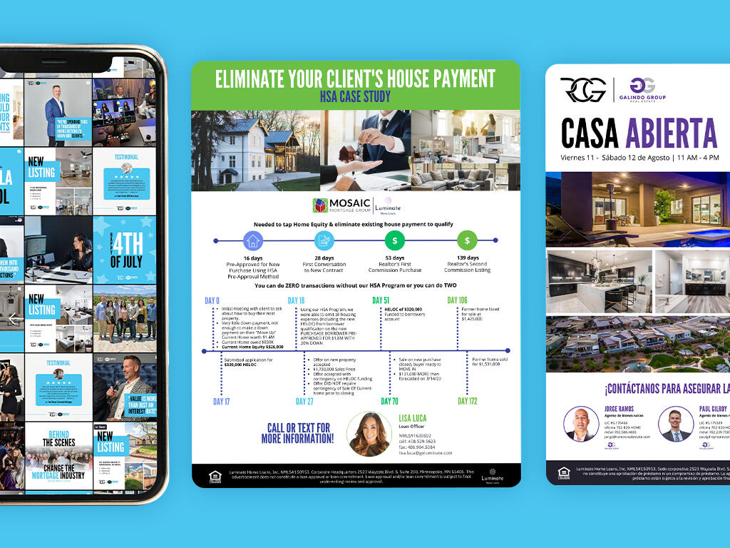
RCG HOME LOANS
Service
Landing page, flyers, business cards, infographics, presentation design, document layout, social media posts, gifs
Client
Robert Coomer Group
Date
2023
American mortgage company, with a mission to unlock people's full potential through finances and provide them with clarity through every step of the loan process.


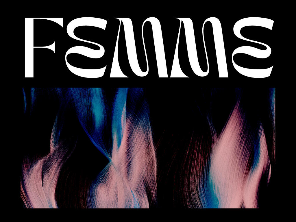
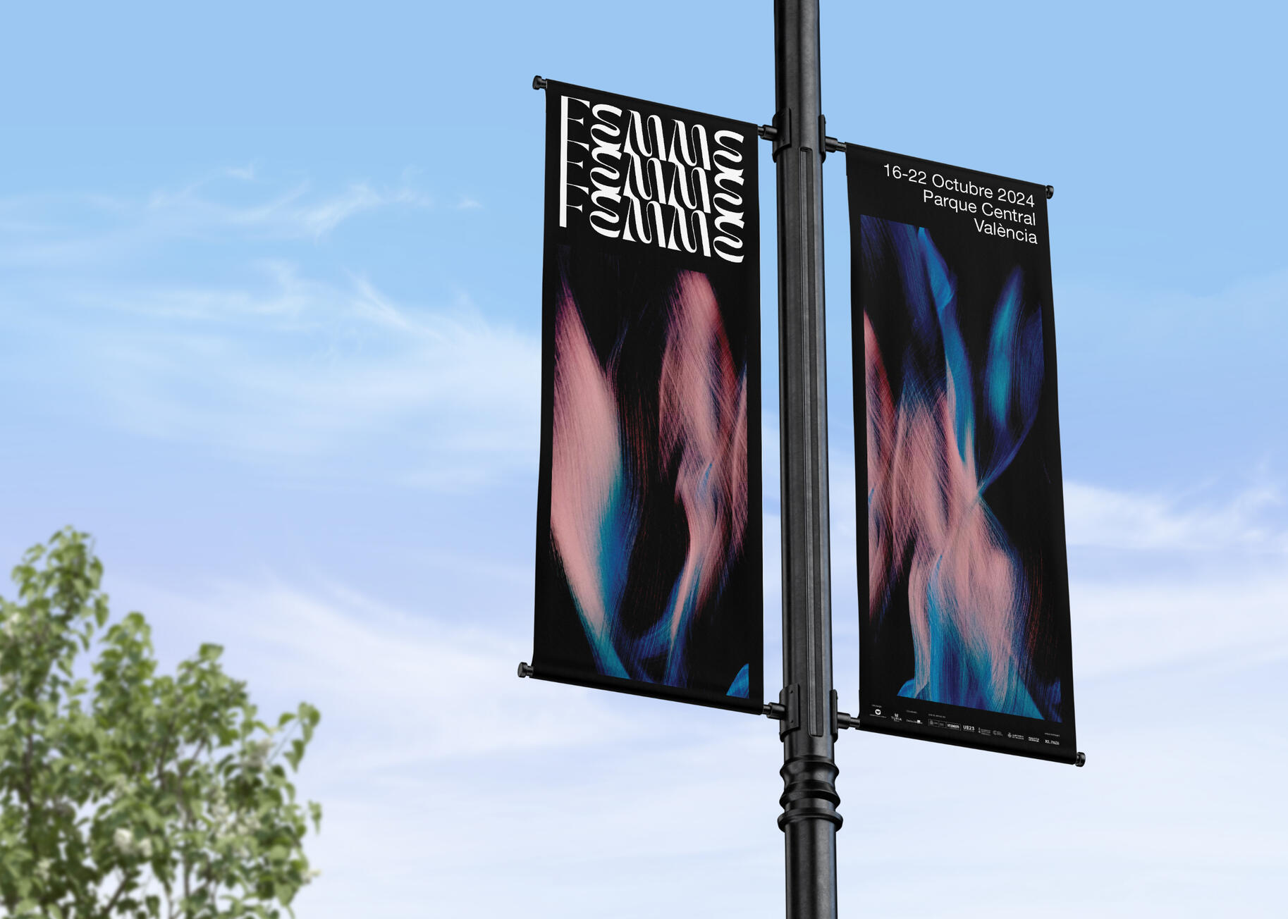
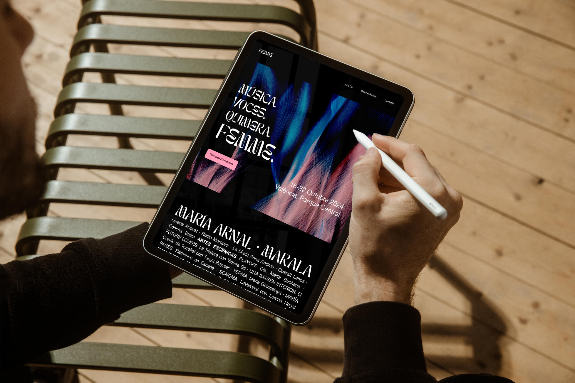
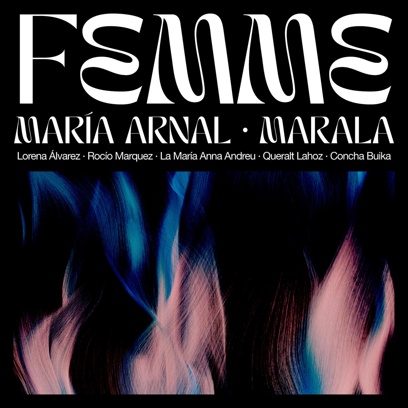
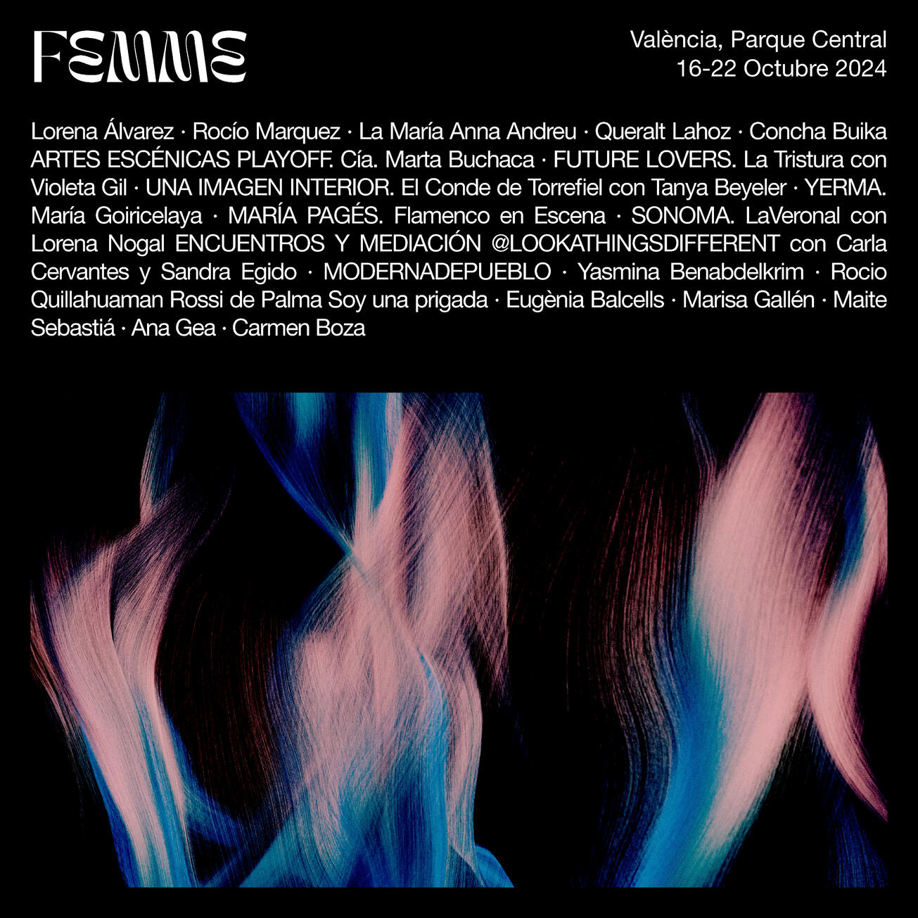
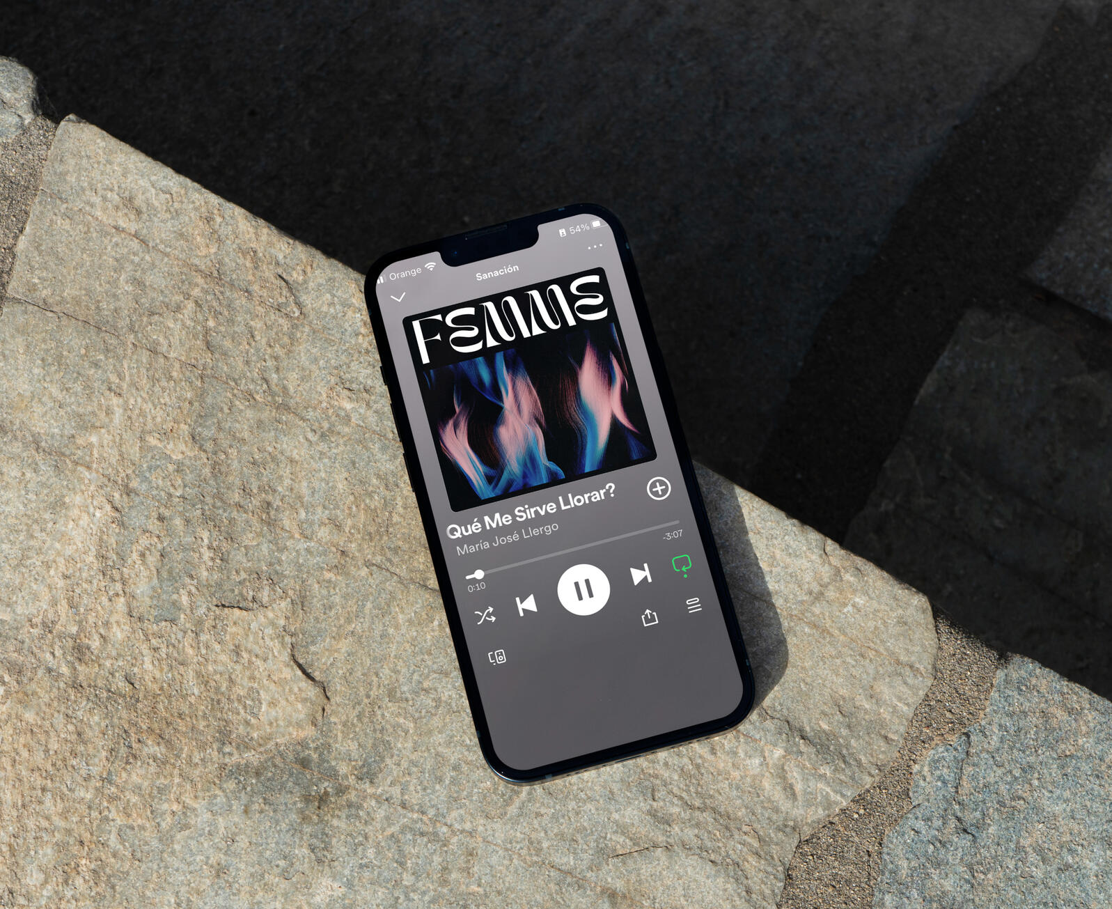
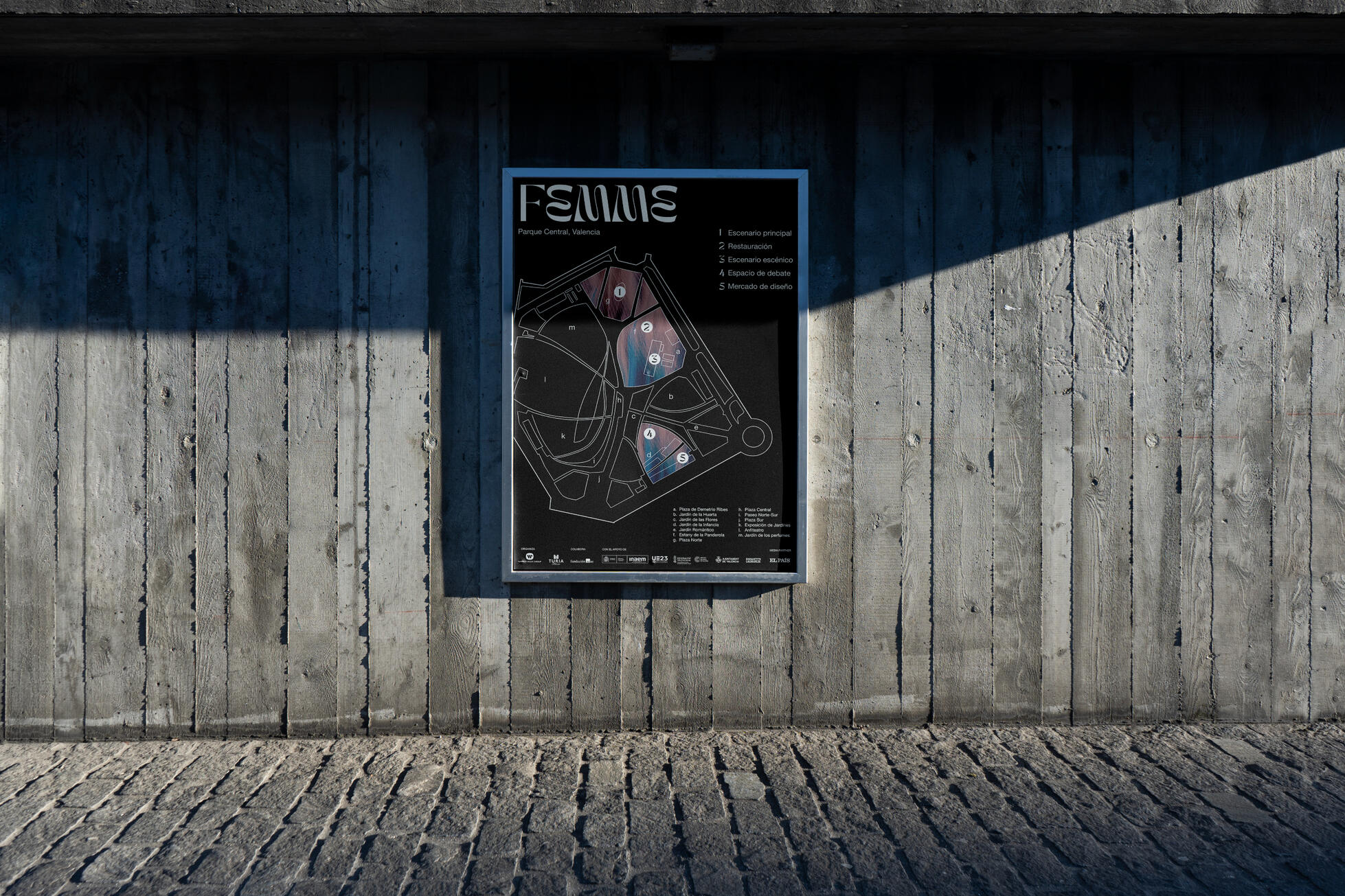
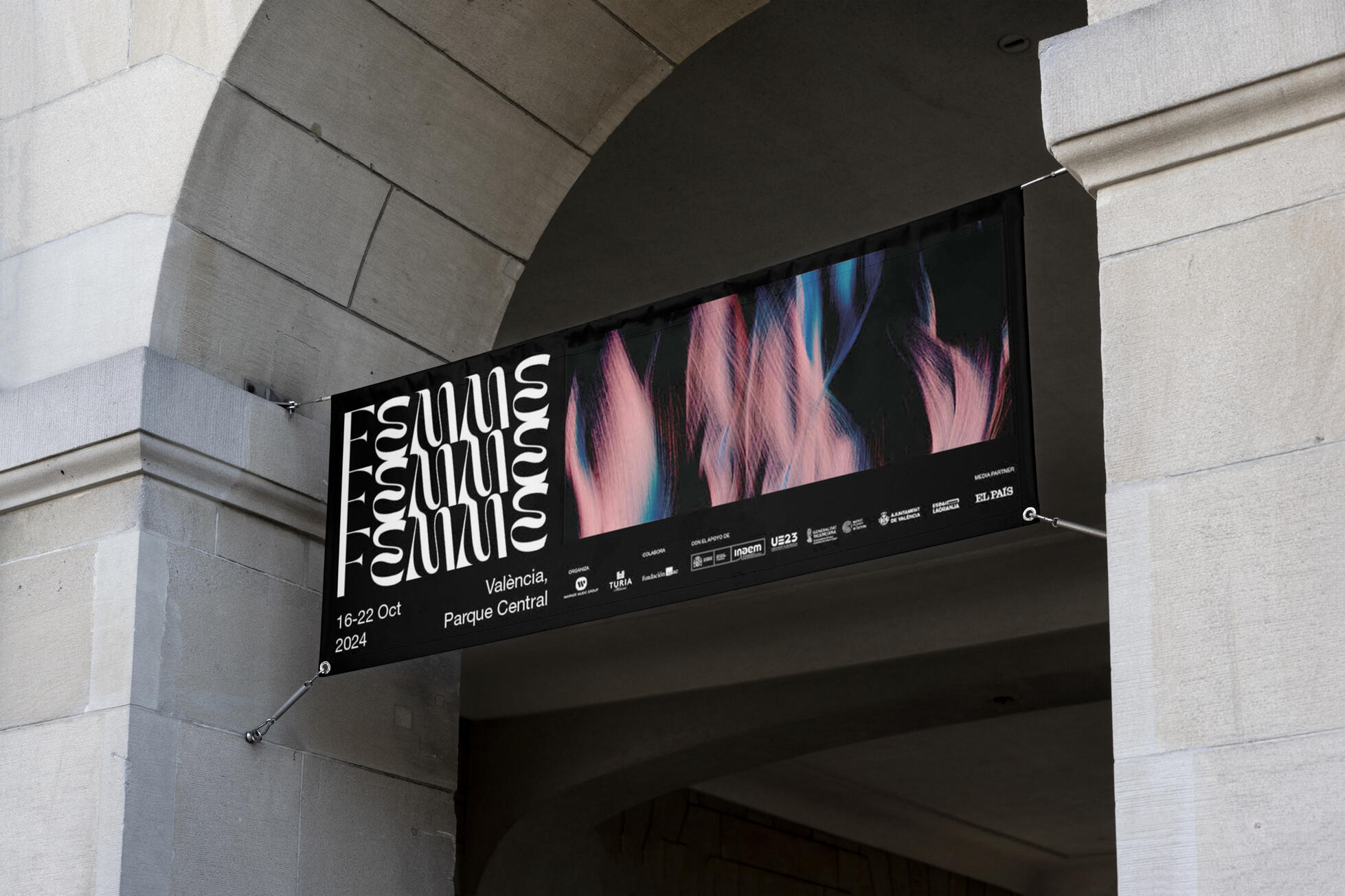
FEMME
Service
Brand identity, social media posts, advertising, landing page, communication
Client
FEMME
Personal and collaborative project
Date
2023
The Product
Femme was a comprehensive branding and communication project for a international cultural festival designed to celebrate and elevate women's contributions in music, performance, authorship, and social subversion. Envisioned as a leading platform for feminist values, the festival aimed to create a vibrant space for celebration, connection, and education.

The Challenge
Develop a distinct and impactful brand identity that could effectively communicate the festival's multifaceted mission. We needed to:Establish a strong visual language
That resonated with a diverse audience while maintaining a clear feminist message.Create a cohesive brand experience
Across various touchpoints, from digital platforms to physical advertising.Capture the spirit of celebration and activism
In a way that felt both empowering and inclusive.Create a landing page
That would be informative, engaging, and would generate leads.
The Solution
Our collaborative team adopted a holistic approach, working together through every stage of the project, from initial analysis and briefing to design and delivery. My role focused on art direction, ensuring a unified visual aesthetic, and included:Landing Page Design
We conceptualized and designed the festival's landing page, creating an intuitive and engaging user experience that effectively conveyed key information and encouraged participation.Print Deliverables
We crafted the main festival poster, a series of banners and signage to help establish the core visual identity and messaging of the festival.Social Media Visuals
We designed the cover for the festival's Spotify playlist, extending the brand's visual language into the audio space. And we created engaging social media content, ensuring consistent brand messaging and visual appeal.Art Direction
I oversaw the overall visual direction of the project, ensuring consistency and alignment with the festival's core values.The resulting brand identity was bold, dynamic, and reflective of the festival's mission, successfully bridging the gap between artistic expression and social activism. The integrated communication strategy, encompassing digital and physical mediums, created a compelling and cohesive brand experience that resonated with the target audience.
The Takeaway
The importance of a collaborative and holistic design process in creating a strong brand identity.
The power of visual communication to convey complex social messages.
The importance of creating a cohesive brand experience across all platforms.
The effectiveness of art direction in maintaining a unified visual aesthetic.
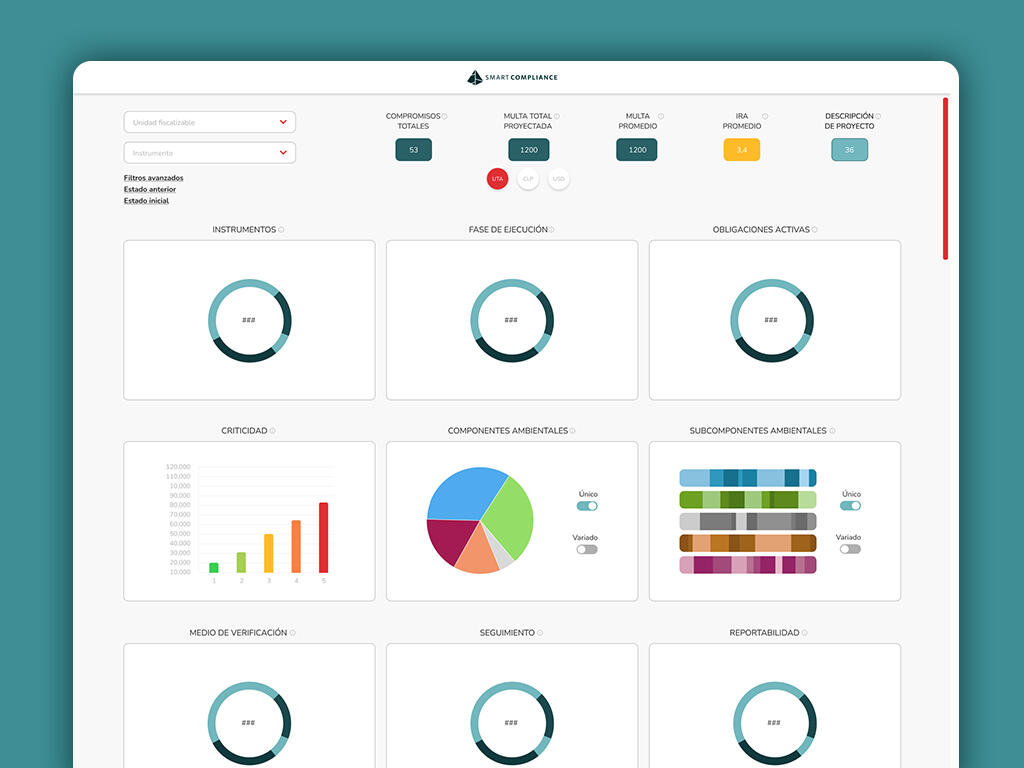
SMART COMPLIANCE
Service
UX/UI design, brand identity, infographic, presentation design, social media posts
Client
Smart Compliance
Date
2021-2022
The Product
UX/UI design forthe Sistema de Inteligencia Ambiental (SIA -Environmental Intelligence System), an innovative solution developed by a multidisciplinary team specializing in environmental regulation and sustainable project management. The SIA allows the company to process, analyze, and interpret large amounts of environmental data, generating strategic knowledge for all project phases, from pre-feasibility to legal defense.

The Challenge
Environmental regulation and sustainable project management generate a massive influx of data. The Sistema de Inteligencia Ambiental (SIA) faced the challenge of transforming vast, complex environmental data into clear, actionable intelligence. Users struggled with:Data Overload
Managing the sheer volume and complexity of environmental information.Inefficient Analysis
Difficulty in quickly and accurately interpreting complex data.Limited Prediction
Inability to effectively forecast environmental impacts and plan proactively.Fragmented Workflows
Managing environmental aspects across project phases with disjointed tools.Communication Barriers
Difficulty in clearly conveying environmental insights to stakeholders.Lack of efficient user workflows
Causing delays and errors.Lack of clear visual hierarchy
Making it difficult to find important data.In essence, the challenge was to create an interface that could bridge the gap between raw environmental data and strategic environmental intelligence, empowering users to make informed decisions and drive sustainable project outcomes.
Optimizing Informed Environmental Decision-Making Through Intuitive Design
The Solution
Throughout the design process, we prioritized user-centric principles, conducting thorough user research and usability testing to ensure that the SIA met the needs of its target audience. This iterative approach allowed us to refine the design based on user feedback, resulting in an intuitive and efficient system that empowers informed environmental decision-making.Data Visualization for Enhanced Comprehension
We implemented intuitive and easy-to-read graphics, such as interactive charts, heatmaps, and timelines. These visualizations were designed to translate complex environmental data into easily digestible formats, allowing users to quickly identify trends, patterns, and potential risks.This approach facilitated rapid understanding and analysis, minimizing cognitive load and enabling users to focus on strategic interpretation.Structured Information Architecture for Efficient Navigation
Clear forms and tables were designed with a logical information hierarchy, ensuring that critical data was easily accessible and understandable. By prioritizing key metrics and using consistent layouts, we streamlined the user's workflow and reduced the time required to locate relevant information.This structured approach allowed users to efficiently navigate the system and access the specific data they needed, when they needed it.Visual Clarity and Actionable Feedback
We employed a clear and consistent color palette to differentiate actions and data categories. This visual coding provided immediate feedback, guiding users through the system and minimizing errors. For instance, using green, yellow, orange and red as indicators in status and priority. The use of universal icons and clear labeling further enhanced usability.This visual clarity ensured that users could quickly understand the status of their projects and take appropriate actions.Guided User Flows for Streamlined Processes
The system was designed with clear, step-by-step user flows, simplifying complex processes and guiding users through critical tasks. This approach ensured that users could confidently perform tasks such as generating environmental impact reports, analyzing regulatory compliance, or predicting future scenarios without requiring extensive training. We incorporated progress indicators and tooltips to provide real-time guidance and support.This guided approach reduced user frustration and increased efficiency, enabling users to focus on the strategic aspects of their work.


The Takeaway
Data Visualization is Crucial for Complex Information. Transforming vast, complex datasets into clear, intuitive visuals significantly enhances user understanding and facilitates informed decision-making.
A well-structured information architecture hierarchy, with clear categorization and logical navigation, is essential for users to quickly access and interpret relevant data.
User-Centric Design Empowers Strategic Action. Prioritizing user needs and workflows through intuitive interfaces and guided processes enables users to leverage data for strategic planning and proactive management.
Visual Clarity Enhances Accuracy. Consistent color coding and visual cues minimize errors and ensure users can quickly identify critical information and take appropriate actions.
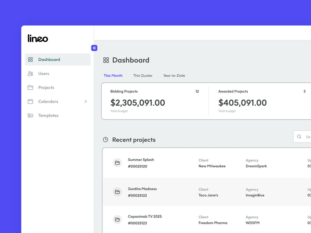
LINEO
Service
UX/UI design, brand identity
Client
Good Times
Date
2024
The Product
Creating an accessible and user-friendly AI-powered solution for production companies.In this project we focused on designing an intuitive experience for producers managing bids, calendars, and collaboration. The design emphasizes clear information architecture, accessibility, and streamlined workflows to empower users at every stage of the production process.

The Challenge
Production companies face a multitude of challenges in managing the complex logistics of film, television, and commercial projects. From handling numerous bids and scheduling intricate calendars to fostering seamless team collaboration, the process is often fragmented and overwhelming. Existing tools frequently lack the intuitive design and accessibility needed to streamline these workflows, leading to inefficiencies, errors, and increased stress for producers. The core problem was to create an AI-powered solution that could consolidate these disparate tasks into a user-friendly platform, empowering producers to manage their projects with greater clarity and control. Specifically, the challenge was to design an interface that:Simplifies Bid Management
Allows for quick and accurate bid comparisons and approvals, eliminating manual data entry and reducing errors.Streamlines Scheduling and Calendar Management
Provides a clear, visual representation of project timelines, ensuring that all team members are aligned and deadlines are met.Enhances Team Collaboration
Facilitates seamless communication and file sharing, enabling efficient collaboration across geographically dispersed teams.Ensures Accessibility
Caters to users with diverse needs and technical abilities, ensuring that the platform is inclusive and easy to use for everyone.
Empowering Production Teams with an Intelligent and Streamlined Platform
The Solution
To address the challenges of fragmented production workflows, we designed an solution that prioritizes clarity, efficiency, and accessibility. The platform was built with a user-centric approach, focusing on creating an intuitive experience that empowers producers at every stage of the production process. Key design elements included:Intuitive Information Architecture
We implemented a clear and logical information architecture, organizing data into easily digestible modules. This allowed users to quickly navigate between bids, calendars, and collaboration tools, reducing cognitive load and improving efficiency.Streamlined Bid Management
The AI-powered bid management system simplifies the process by automatically extracting key information from bids and presenting it in a clear, comparative format. Users can easily analyze and approve bids, reducing the risk of errors and saving valuable time.Visual Calendar and Scheduling
An interactive calendar interface provides a clear, visual representation of project timelines, allowing producers to easily manage schedules and deadlines. The platform also integrates with AI-powered scheduling tools, which can automatically optimize schedules based on resource availability and project requirements.Seamless Collaboration Tools
The platform incorporates integrated collaboration tools, such as activity log and comments, file sharing, and version control, enabling seamless communication and collaboration across teams. This reduces the need for multiple communication platforms and ensures that everyone is working from the same information.Accessibility-First Design with Clear Visual Hierarchy
We adhered to accessibility best practices, ensuring that the platform is usable by individuals with diverse needs. Clear visual hierarchy through color contrast and font weights allows users to quickly identify key information.Template Management and Workflow Automation
To enhance productivity, the platform offers centralized template management for bid letters and budget layouts, ensuring brand consistency and personalized workflows. Automated workflows eliminate tedious tasks, freeing up producers to focus on strategic aspects of their projects.AI-Powered Assistance
AI is utilized to provide predictive analysis of potential scheduling conflicts, and to help organize and prioritize tasks.By focusing on these key design elements, we created an AI-powered solution that empowers production teams to manage their projects with greater efficiency, clarity, and control. This resulted in improved collaboration, reduced errors, and increased productivity, ultimately contributing to the success of production projects.


The Takeaway
Integrating disparate production tasks into a single platform significantly streamlines workflows and reduces time spent switching between tools.
Leveraging AI for tasks like bid analysis, scheduling optimization, and purchase order creation automates tedious processes and minimizes human error.
Real-Time Collaboration Improves Team Alignment. Integrated collaboration tools facilitate seamless communication and ensure that all team members are working from the same information.
Offering customizable templates, budget layouts, and filtering options allows users to tailor the platform to their specific workflows and preferences.
Accessibility is a Core Design Principle. Prioritizing accessibility ensures that the platform is usable by individuals with diverse needs.
A well designed visual hierarchy allows the user to quickly identify the most important information and reduces errors.
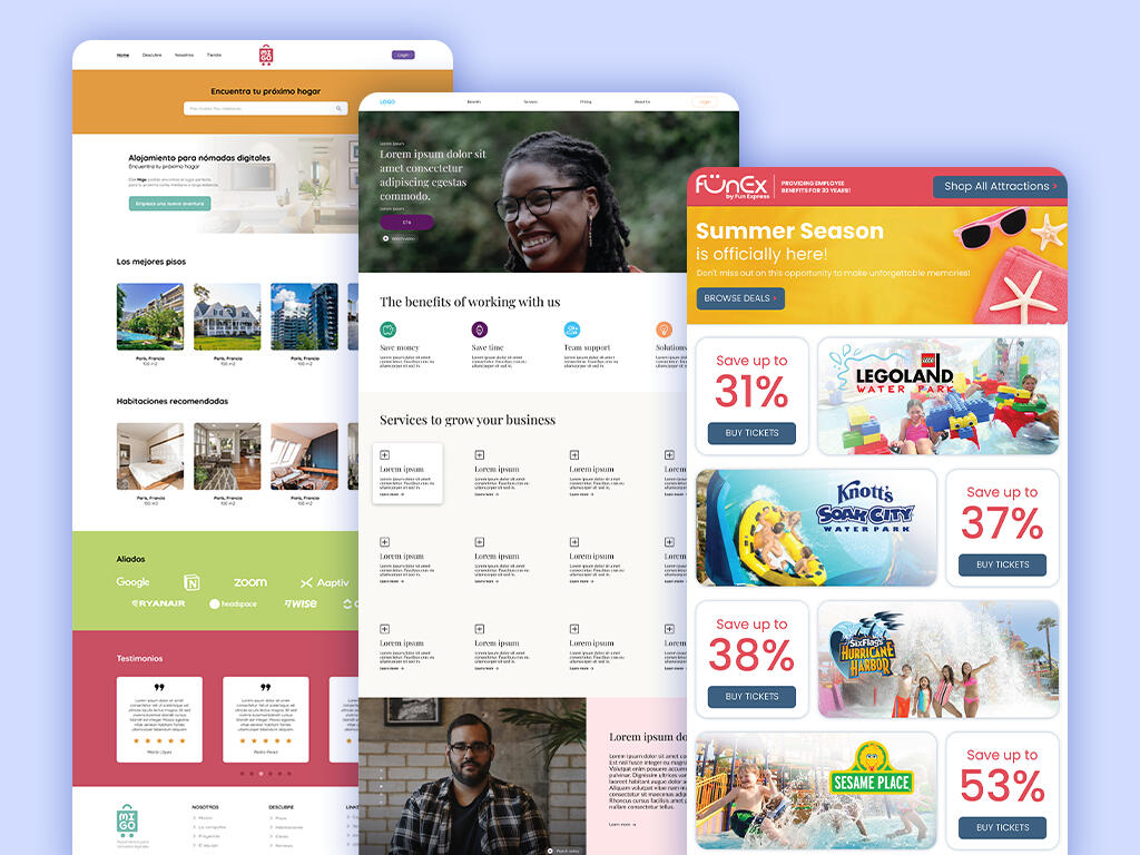
LANDING PAGES
Service
UX/UI design, brand identity, landing page
Client
Toucan Talent, RCG, personal projects
Date
2021-current
Design high-converting landing pages that seamlessly blend intuitive UX with compelling visuals. Transformed complex information into clear and compelling calls to action.By combining user-centered UX/UI design, impactful graphic design, and engaging illustrations, created solutions that drive results for brands.


PRODUCT PHOTOGRAPHY
Service
Photography, digital retouch
Client
Personal project
Date
2024
The detailed illustrations on these products take center stage in this photography series. Utilizing clean, minimalist backdrops to ensure that the artwork remains the focal point, allowing its vibrant colors and details to shine.


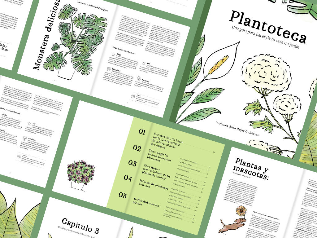
PLANTOTECA
Service
Editorial design, illustration
Client
Personal project
Date
2023
Magazine focused on the care of home plants and divulgation of information on the subject.Design focus on having a clear layout and information hierarchy. Maintaining the balance between text and illustrations so they can co-exist in harmony.


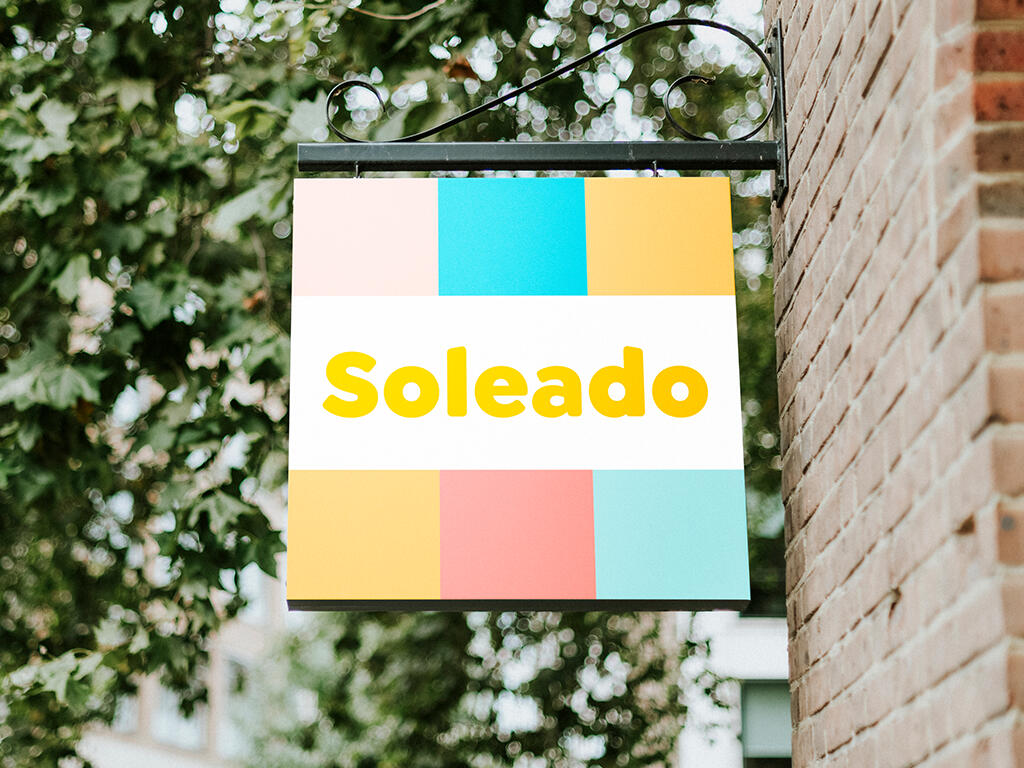
SOLEADO
Service
Brand identity, storytelling, motion graphics, social media posts, merchandise design
Client
Soleado
Personal and collaborative project
Date
2024
Coconut-based iced cream shop.The goal was to capture the essence of tropical indulgence and create a brand that feels warm, friendly, and inviting. The storytelling focuses on shared moments and the simple joy of a delicious treat, creating a brand that connects with customers on a deeper level.


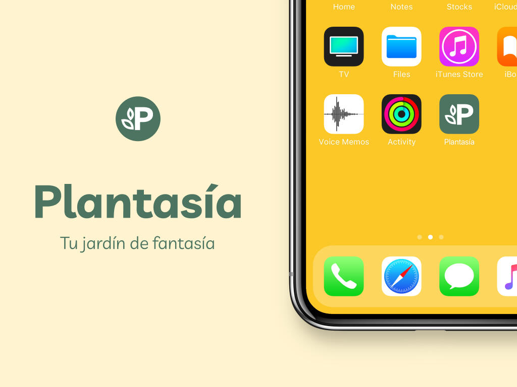
PLANTASIA
Service
Brand identity, UX/UI design, app design, landing page, illustration
Client
Plantasia
Personal and collaborative project
Date
2024
The Product
Plant care app designed for simplicity and ease of use, targeting users who prefer minimal notifications and a straightforward experience. The app focuses on essential plant care information, delivered in a clear and concise way.The accompanying landing page design reinforces this message. The goal is to generate leads by showcasing how easy and unintrusive plant care can be with this app.

The Challenge
Many plant care apps overwhelm users with excessive notifications, complex features, and a steep learning curve. This creates a barrier for individuals who desire a straightforward, unintrusive approach to plant care. Our target users, who value simplicity and efficiency, struggle with:Time Constraints
They seek to optimize the time spent on plant care, avoiding lengthy routines and constant monitoring.Information Overload
They desire clear, concise guidance on when and how to care for their plants, tailored to specific needs like season, temperature, and fertilization.Knowledge Gaps
They wish to expand their understanding of plant care and discover plants suitable for their spaces.Plant Selection Challenges
They prefer resilient plants that thrive with minimal effort.Invasive Notifications
They are averse to constant, disruptive notifications, preferring a more passive and optional approach to reminders.Lack of Personalized Recommendations
They want plant recommendations that fit their specific space and lifestyle.High Cost and Subscription Models
They prefer a one-time, affordable purchase over ongoing subscriptions.The core challenge was to design an app that provides essential plant care information in a user-friendly, minimalist format, empowering users to cultivate healthy plants without feeling overwhelmed.
Cultivating Simplicity: An Intuitive Plant Care App for Effortless Gardening
The Solution
To address the challenges of complex plant care apps, we designed a solution that prioritizes simplicity, clarity, and user control. The app focuses on delivering essential information in a concise and accessible manner, empowering users to care for their plants with ease. Key design elements included:Minimalist Interface
The app features a clean, intuitive interface that minimizes distractions and focuses on core functionalities.Essential Plant Care Information
Users can access clear and concise guides on plant care, including seasonal tips, temperature recommendations, and fertilization schedules.Personalized Plant Catalog
A comprehensive plant catalog allows users to explore and learn about various plant species, with a focus on resilient varieties.Space-Based Plant Recommendations
A quiz feature helps users identify ideal plants based on their available space and environmental conditions.Visual Recognition
Users can quickly identify plants using the app's visual recognition feature, simplifying plant identification.Non-Invasive Calendar Integration
An optional calendar integration allows users to schedule plant care tasks without intrusive notifications.Tips and Advice Section
A dedicated section provides practical tips and solutions for common plant care challenges.Clear and Concise Notifications
Notifications are optional and non-invasive, providing gentle reminders without overwhelming the user.User-Friendly Navigation
The app is designed with intuitive navigation, ensuring a seamless and enjoyable user experience.By focusing on these key design elements, we created a plant care app that empowers users to cultivate healthy plants with minimal effort and maximum enjoyment. The accompanying landing page reinforces this message, showcasing the app's simplicity and ease of use, and driving lead generation.


The Takeaway
A minimalist interface and straightforward functionality are crucial for attracting and retaining users who value ease of use.
Personalization Enhances User Experience. Tailored recommendations, customizable interfaces, and optional features cater to diverse user preferences and needs.
Offering optional notifications and calendar integration respects user time and preferences, fostering a positive user experience.
Clear and Concise Information is Essential. Providing essential information in a digestible format empowers users to quickly understand and apply plant care knowledge.
Affordability and Accessibility Drive Adoption. Offering a one-time purchase model and prioritizing accessibility ensures that the app is accessible to a wider audience.
Understanding the target audience is vital. To know what kind of features and experience to deliver.
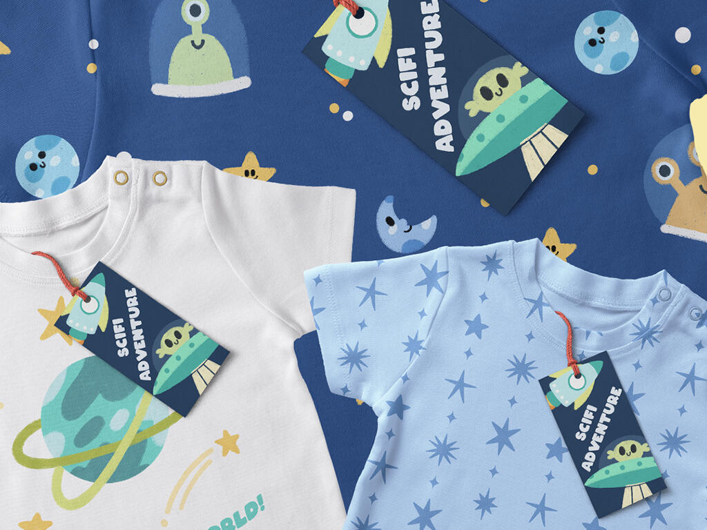
SCI-FI ADVENTURE
Service
Illustration, pattern design
Client
Personal project
Date
2023-2024
Children's fabric capsule collection inspired by the wonders of space and the thrill of exploration. The sci-fi themed patterns and illustrations bring a touch of the cosmos to everyday life, perfect for little astronauts and adventurers, capturing the spirit of childhood curiosity and imagination.


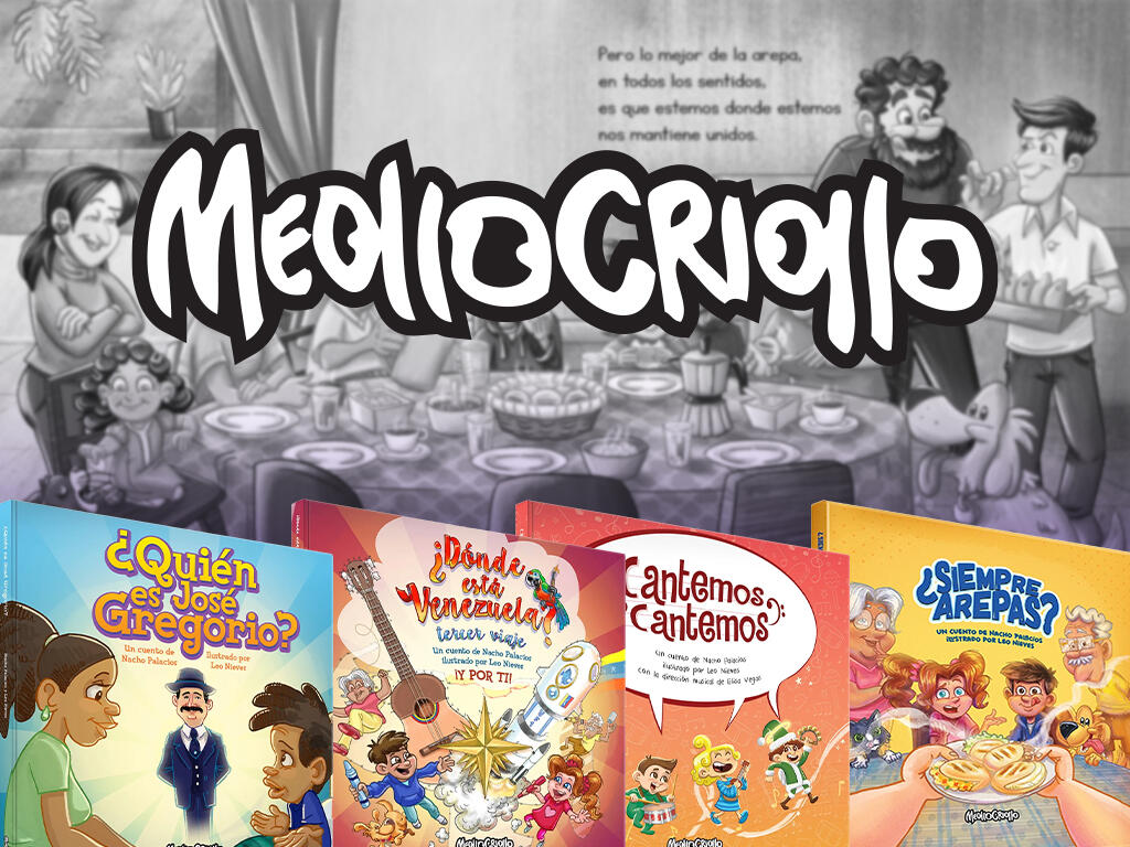
MEOLLO CRIOLLO
Service
Illustration, editorial design, social media posts, 2D animation
Client
Meollo Criollo
Date
2018-2023
Editorial with the aim of creating illustrated content that generates reflection, belonging, values, and optimism in our audience, from children to adults.Worked on projects, such as ¿Quién es José Gregorio Hernández?, Cantemos Cantemos, ¿Siempre Arepas?, ¿Qué pasa en el mundo?, ¿Dónde está Venezuela? - trilogy, etc.


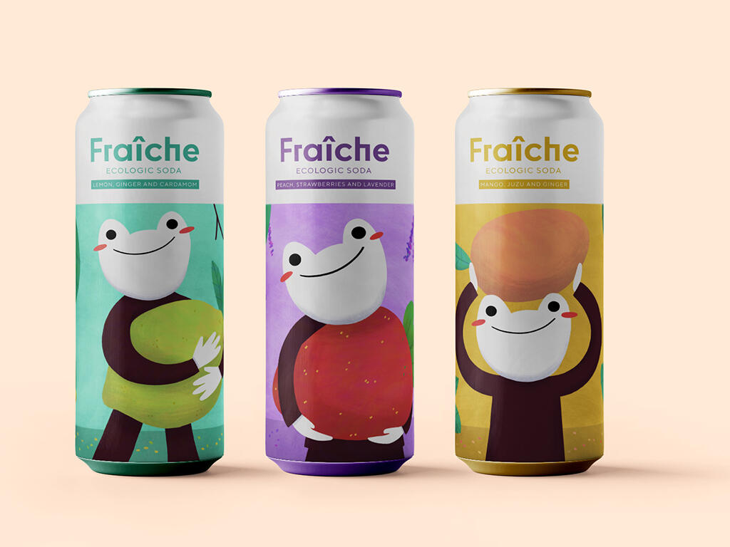
FRAÎCHE
Service
Illustration, product design, poster design, animation
Client
Fraîche
Personal project
Date
2023-2024
Product design and limited edition posters for Fraîche, an organic soft drink brand.Focus on showcasing the vibrant illustrations and a clean, modern layout across three distinct flavors, capturing the refreshing essence of the brand.


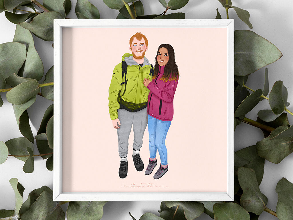
PORTRAIT ILLUSTRATION
Service
Illustration, portrait and pet illustration
Client
Individuals
Date
2019-current
Capturing cherished moments and loved ones through custom portrait illustrations. These commissions celebrate special occasions, from weddings and anniversaries to honoring the memory of those who have passed. Each portrait is a unique and heartfelt keepsake, reflecting the individual's personality and creating a lasting connection.From initial concept to final artwork, each commission is a collaborative process with the client. All done digitally with Procreate.


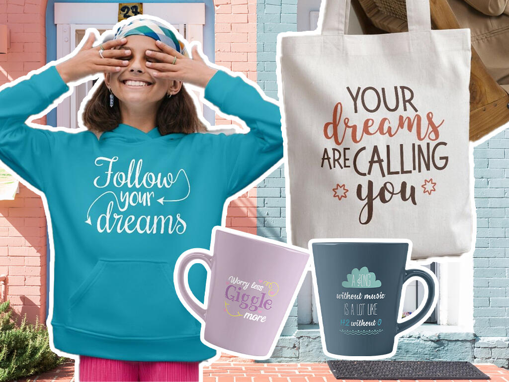
ILLUSTRATYPE
Service
Typographic design for merchandise, vector illustration
Client
Syrenatop
Personal project
Date
2018
Feel-good designs for feel-good products.Initially created for a client's t-shirt line, these typographic and illustrative designs, infused with uplifting messages, were not ultimately used by the client. Recognizing the potential for these designs to bring joy, I took the initiative to expand their application to a wider range of products, including posters, cushions, sweaters, cups, and bags (with the client's permission).This commission turned into a personal project that showcases how positive messages can find diverse avenues for expression and inspiration.


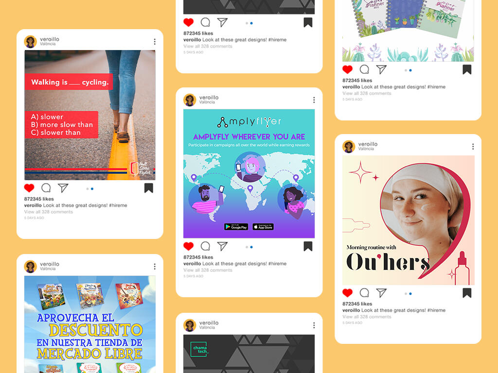
SOCIAL MEDIA
Service
Brand identity, social media posts, illustration
Client
Amplyflyer, Meollo Criollo, Wall Street English, RCG, Smart Compliance, CriptoLeaks, TeatroK
Date
2017-current
Series of engaging social media posts that boost brand's visibility and drive traffic to brand's web and increases follower engagement and brand awareness, bringing the brand to life online.Design within the educational, technological, artistic, real estate, financial and children’s sectors.
RCG
FEMME